Spoonful Magazine Branding System
SCOPE
Art Direction
Discovery & Strategy
Logo Suite
Color Palette
Typography
Brand Guidelines
Custom Lettering
Illustration
Iconography
Editorial Layout
Social Media
Business Cards
Spoonful was an independent quarterly magazine and high-quality cookbook in one, celebrating home cooks and the joy of gathering around the table. During its six issue run, I served as Art Director and sole designer, responsible for building and stewarding the entire visual identity of the brand from the ground up.
Logo Suite
At the heart of Spoonful was a celebration of the imperfect cook — the idea that cooking is messy, joyful, and deeply human. I wanted the visual identity to reflect that spirit.
The logo features a rough, hand drawn mark paired with the clean, bold typeface, Oswald, for the tagline, creating a contrast that felt both approachable and intentional. That same tension carried through every spread, pairing rough illustrative elements with easy-to-read typography using the classic Baskerville and the warm, inviting Gotham. The result was a visual language as layered and satisfying as a good home cooked meal.

PRIMARY LOGO

TAGLINE & ICON

LOGO & TAGLINE


Iconography
A set of custom icons was created to categorize different recipes throughout the magazine, adding a charming, hand-crafted touch to every page.


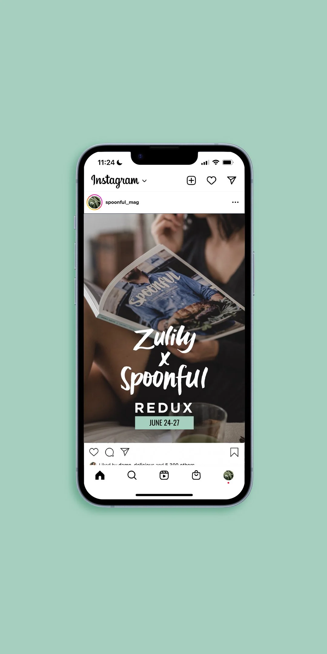
SOCIAL MEDIA TREATMENTS & PROFILE PICTURES