The Yellow Butterfly Branding
We first met Dev when she was a contributor to Spoonful magazine. She reached out when she wanted rebrand her blog under a new name: The Yellow Butterfly. The Yellow Butterfly is so much more than a food blog. It is, at its core, founder Dev Amadeo’s love letter to her daughter.
Dev is the mother of a daughter, Mariana, who was born with a rare genetic disorder. Dev learned more about how nutrients in food could impact Mariana’s development and well being, which sparked her love of cooking. Sadly, her daughter passed away, but that did not keep Dev out of the kitchen. She wanted to rename her site after the butterflies that kept appearing after her daughter’s passing, reminding her that her daughter is still with her.
SCOPE
— Art Direction
— Discovery & Strategy
— Logo Suite
— Color Palette
— Typography
— Brand Guidelines
— Custom Lettering
— Illustration

HORIZONTAL LOGO
logo suiteDev came to the table with a very specific idea in mind and it was a great opportunity to bring that to life. Her style is classic, clean, and delicate.
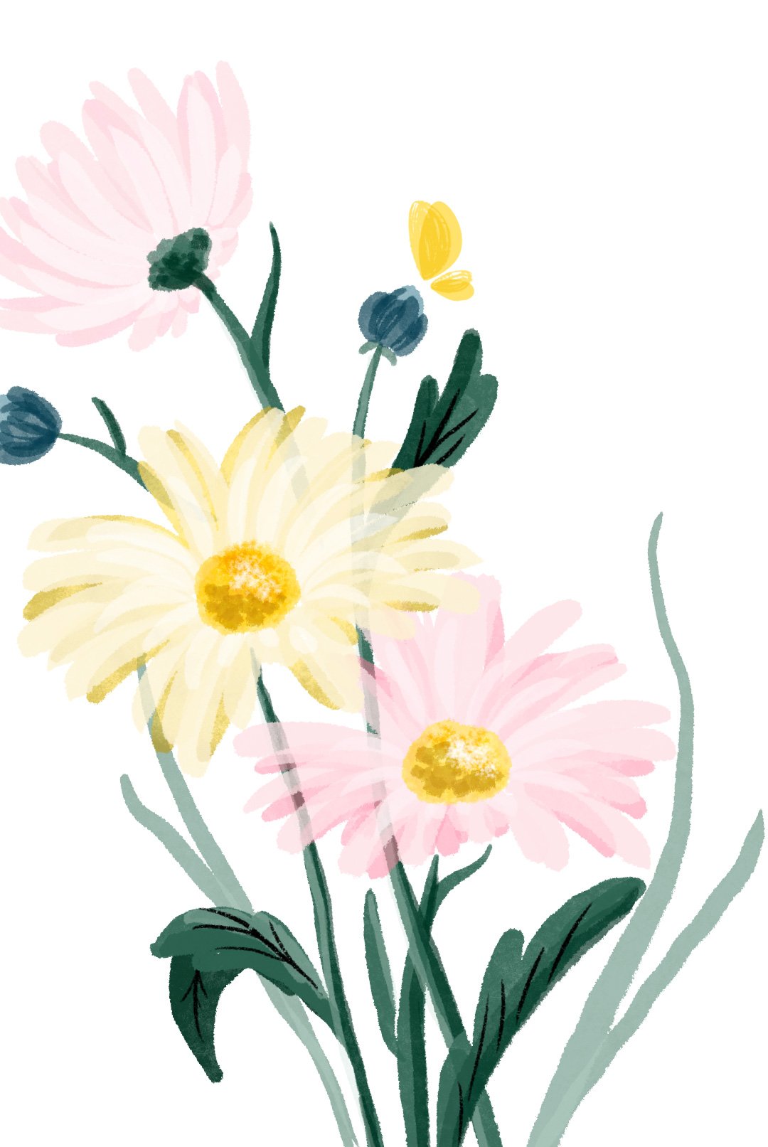
We created custom monoline lettering paired with Karolina Lach’s rounded serif font Arbutus Slab. A yellow butterfly is gently landing on the curve of the “w”. Mariana’s favorite color was yellow, so it was crucial that we picked the perfect yellow.
We kept the shape of the butterfly itself rather simple, so that it would not compete with the detailed photographs featured on Dev’s website. For the brand marks, we added a rough hand-painted texture to the butterfly to convey movement and to tie into the custom floral illustrations that we created for the brand.
Overall, we wanted to create a logo suite that was as warm and inviting as Dev is.
STACKED LOGO

BRAND MARKS

FAVICON

COLOR PaletteThe Yellow Butterfly palette was inspired by nature and compliments Dev’s gorgeous food photography that is the hero of the blog.
The primary palette is made up of blue, yellow, and neutrals. The secondary palette features a bold array of cool and warm colors to expand the brand colors.
An extended accent palette of soft pastels and dark tones was also created for when a wider selection of shades is needed.


TypographyHeadlines are given a soft and feminine touch with Arima Madurai that compliments Dev’s aesthetic style. Arima Madurai also has a calligraphic influence, which it shares with Mirza, by KB Studio. Using Mirza sparingly for sub-headers provides a nice transition to the body copy, which is set in Arbutus Slab.

SELECT PAGES FROM
the yellow butterfly brand guidelines
custom type & illustrationWe created a series of custom lettering and illustrations as decorative elements to be used throughout The Yellow Butterfly site and brand.
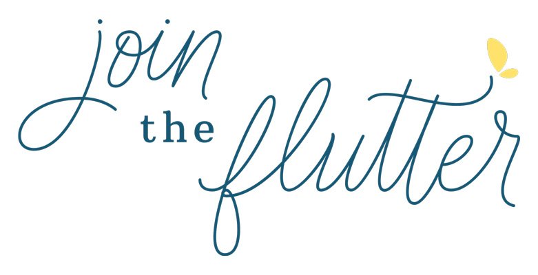
Dev wanted custom lettering tho highlight specific sections on her site. We expanded on the monoline script we used in The Yellow Butterfly logo for the call-outs:
Hello Butterflies — Welcoming readers
Currently Craving — Recipe spotlight
Join the Flutter — Subscribe to The Yellow Butterfly newsletter
Dev — Custom sign-off