Girl & the Goat
Menu Redesign
Since opening in 2010, award-winning chef Stephanie Izard’s Girl & the Goat restaurant has become a Chicago staple.
After using the same menu design since their opening, Stephanie thought it was time to try something new. Working closely with Stephanie and her creative director, Gabbie Gresgie, we created a brand new menu system—from the design elements, to the size, to the paper stock that would last another 10 years.
— Layout
— Color Palette
— Illustration
Stephanie Izard
Gabbie Gresge
CREATIVE DIRECTORSSCOPE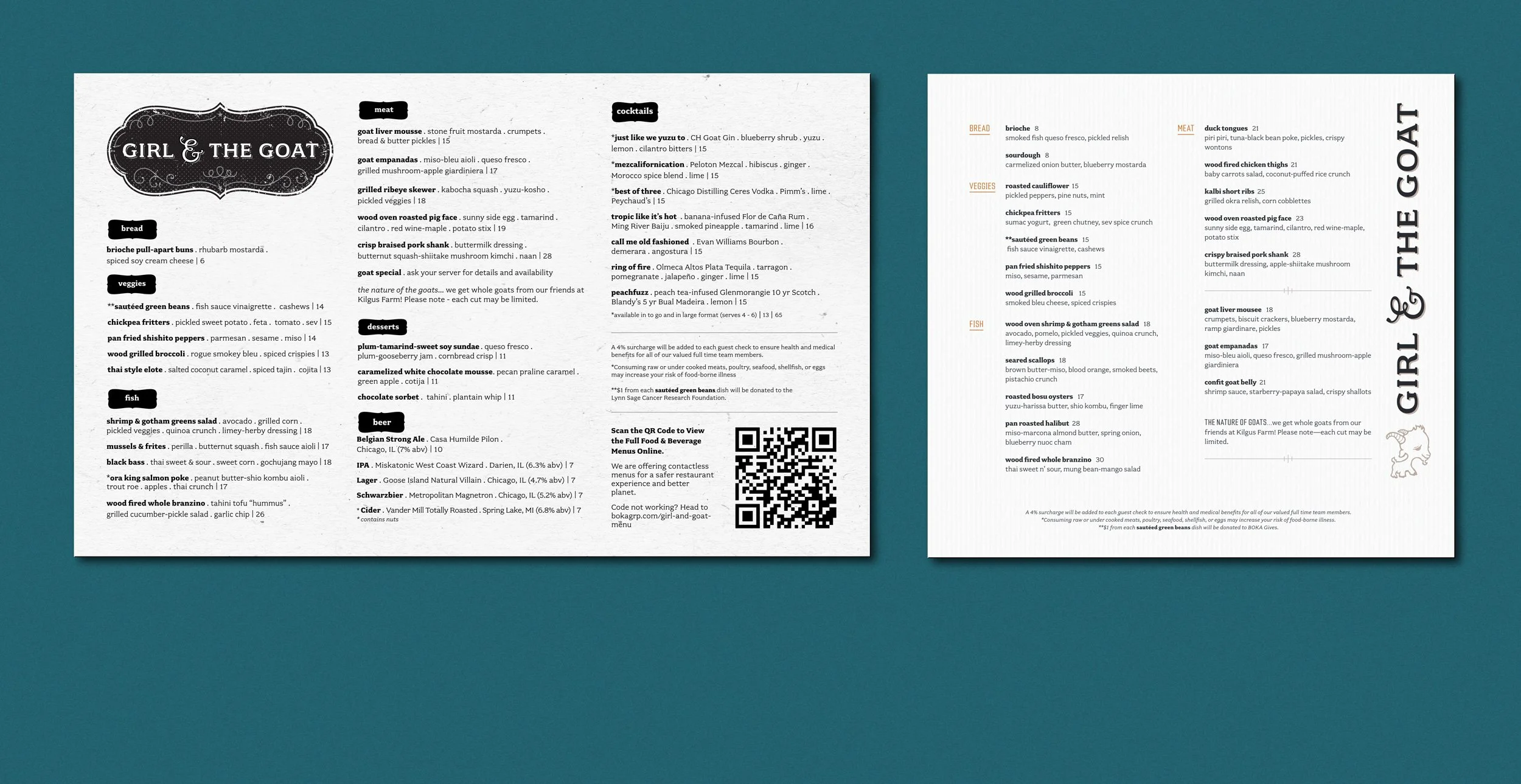
OLD MENU
NEW MENU
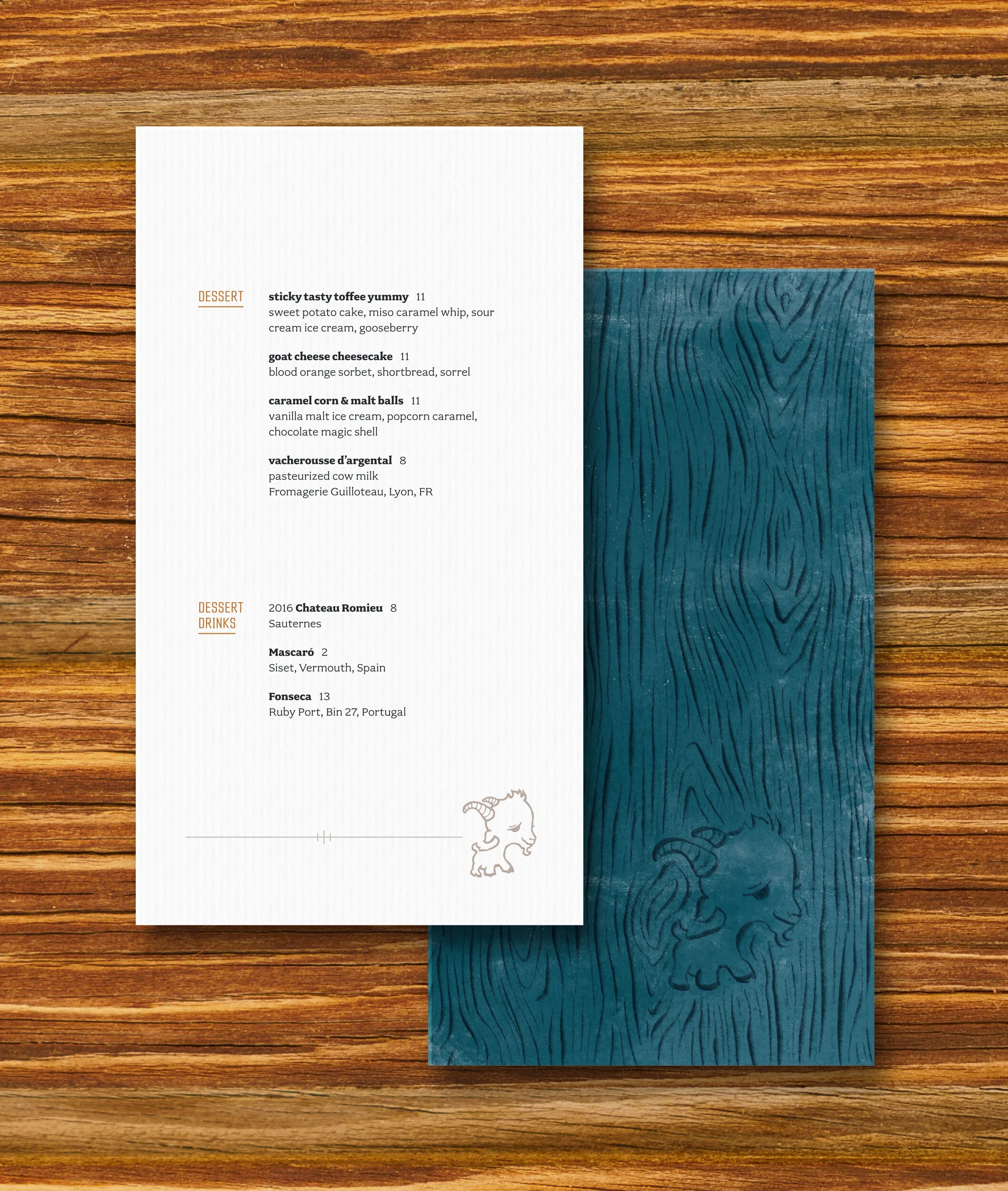
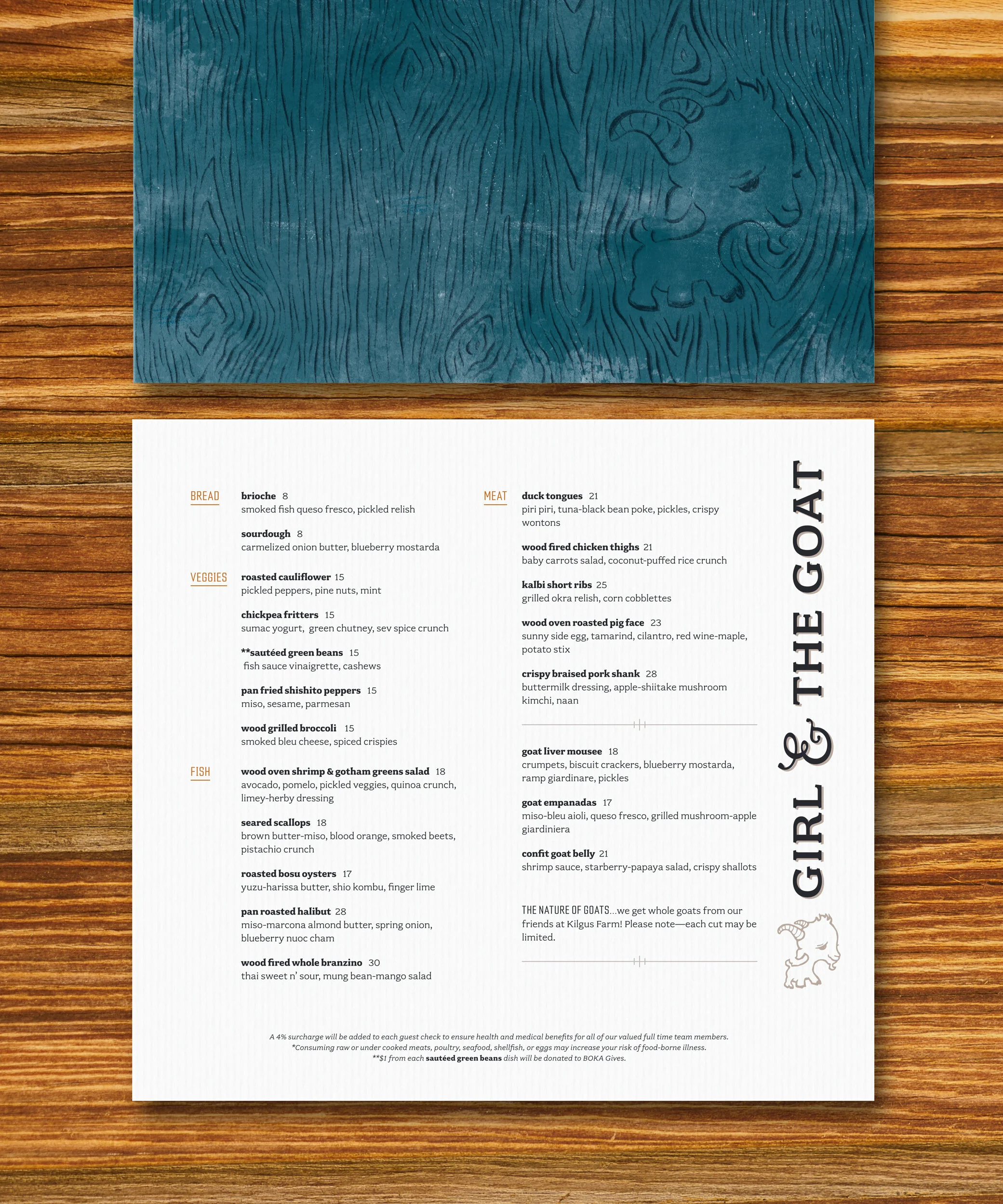
Stephanie liked the idea of having a smaller sized menu and breaking out the desserts and drinks to their own menus. Above everything, the overall system had to be easy to adapt to any menu changes over time.
While embracing Girl & the Goat’s timeless logo and brand style, we also wanted to bring in some color to add some more visual interest. I took inspiration from the restaurant’s gorgeous interior; there is a mix of rustic organic textures that contrast with clean industrial lines. The food itself is a beautiful combination of textures and pops of bright colors. To continue this theme, I used a mixture of a condensed and geometric typeface for the headlines, against the softer serif typeface used for the body copy.
I also kept the overall menu layout very structured. On the back of the menus there is a very loose drawing of the famous goat logo hidden within a woodgrain texture—a call back to all the wood used throughout the restaurant interior.
In the end, we created a beautiful menu system just in time for their reopening after the pandemic.
Girl and the Goat
Girl and the Goat